Designing The Title
Hey it's Kazmin and the girls and today we went over title design
The Fonts we will be using will be the Fonte Forward, STHupo, and the Trade Gothic Inline. STHupo matches well with the characters. The characters are famous youtubers and the text font STHupo is very advanced and technological looking. This gives the audience a mood that this film will be more updated on technology. Fonte Forward looks very professional it gives the idea that this film will be directed well because of the editing.
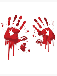
The Contrast will be red because of the blood and horror that is about to happen but depending on the scene it can alter between different shades of red and black. The effect of having red will change how the audience looks at the film. The adding of red to the text type will make the audience think that there will be gore or a murder in the opening sequence because red is the color of blood.
The Font Size will be size 28 it will be Big enough to see on the screen. But not too big because we don't want it to overflow the screen. Maybe we can include it in one of the lives the main character does. This would be a clever way of showing the focus of technology. Also the story has to give off the affect that teenagers do stupid stuff on the internet. So now, the text shows the events to come because of that.
Titles will stay on the screen for 3 seconds and then fade away. We kind of want it to look like inclined with the new technology in this world so the names can't be there for too long. The flow has to seem natural each scene should have 4 different type of titles. Main titles should be at the end or the beginning. This is to make it memorable it can either be the first thing you remember or the last.


Comments
Post a Comment